Open data policies in times of COVID-19
The COVID-19 pandemic has arisen at a time when governments were already reasonably convinced of the need to make their data accessible via open data portals. The need in question is a relatively new phenomenon, one with not only technical but also strategic and economic factors.
Governments need to share their data more smoothly, and the best way to remove the maximum number of obstacles possible is to offer it to anyone who wants to use it. That they should do so seems only natural, bearing in mind that the taxes we all pay contribute to its production. Additionally, it is hoped that businesses will be able to draw on such data to develop services that might generate new ways of using it and new economic activity.
Scientists are conscious of the necessity of open data too. Here, the main incentive is the reproducibility of scientific results, one of the cornerstones of the scientific method. Recently, however, we have witnessed the emergence of a new approach to science based on analysing large data sets, which is leading us to discover new interactions between the variables that describe our world, as well as to nourish mysterious artificial intelligence algorithms through which, without having to know exactly how they work, we can also obtain results and predictions.
These two types of open data initiatives may use different infrastructure and have different origins and aims, but they are not separate. Governments expect scientists to come up with models to help them predict how the planet will behave and the consequences of particular decisions. Only by guaranteeing a transparent, two-way flow between the two groups is sufficiently smooth cooperation possible. For example, when the Government of Catalonia makes data available via its open data portal, Catalan scientists can use it straight away and produce results and predictions that can then be relayed to the government, just as is already the case where the information on natural heritage and biodiversity offered via the Prismàtic platform is concerned.
What we often forget, however, is that citizens in a democratic society must be able to exercise their sovereignty, to which end they have to be able to oversee their government. I have never been a fan of the distinction made between experts and citizens, as if experts were not citizens or the majority of citizens were not experts in anything. It is as if citizens must merely be consulted every four years and their votes guided by a mysterious intuitive system that enables them to perceive the truth, rather than by knowledge. I feel it is very important to stimulate citizens’ curiosity with interpretable data, especially in the case of the new generations, who can use digital technologies to access data and the tools necessary to interpret it for themselves. Thanks to growing interest in citizen science initiatives and Catalonia’s long-standing tradition of membership of associations, amateur enthusiasts can become experts and oversee and influence policies in a coordinated fashion.
That brings me to the role of citizens as overseers of the policies applied to control and mitigate the effects of the COVID-19 pandemic. It saddens me to see Spain’s national authorities and the Government of Catalonia trading accusations of incompetence in relation to their management of the pandemic, often without any specific evidence. We should not despair, however. Headline-grabbing politics is designed to distract, but politicians have also paved the way for the transparency entailed by open data that we can all analyse calmly while tuning out the clamouring voices.
The Government of Catalonia has made up-to-date information on daily developments related to COVID-19 available, and we also have access to data from the Spanish government and Johns Hopkins University, among many other sources. Modern, eye-catching portals reflect the current situation of the pandemic. Doing so is all well and good, but only provides us with a snapshot of the present rather than a picture of the pandemic’s evolution. To understand the current situation, we need to be able to see how the disease has evolved, which is also the only way to anticipate what could happen over the next few days. To recall past developments we have to go to open data portals that present lists of detected cases, ordered by the different relevant criteria, in the form of long data tables. The Government of Catalonia and Johns Hopkins University offer such lists, which they update every day. The Spanish government also offers lists of the kind in question, through the Carlos III Health Institute, but only updates them roughly every seven to 10 days.
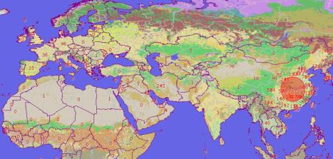
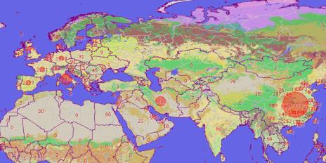
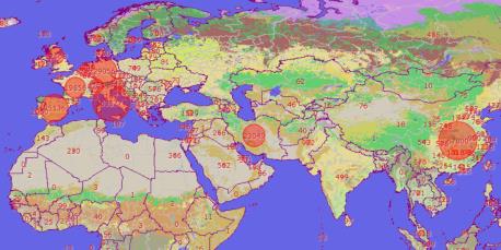
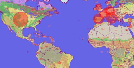
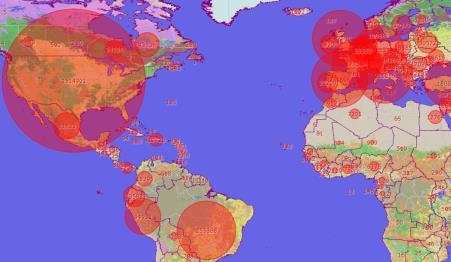
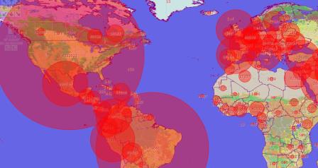
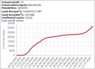
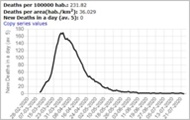
With the above in mind, Grumets, a research group of CREAF and the Autonomous University of Barcelona, has created a COVID-19 map browser that reflects not only the current situation but also everything that has happened since the pandemic began. The open data fed into it covers the whole world (Johns Hopkins University); Spain and each of its provinces (Carlos III Health Institute); and Catalonia and its health areas (Ministry of Health of the Government of Catalonia). One of the browser’s main features is that it firstly presents an estimate of the number of active cases (which represents the situation at any given time more accurately than the cumulative number of cases). It also uses that estimate to generate a map showing the trend in recent days, which is useful, for example, for detecting new outbreaks when there is an upward trend. A dropdown menu containing dates makes it possible to look back at how rapidly the situation has evolved since it arose. Users can see, for instance, how COVID-19 passed from China to Italy, from Italy to Spain, from Europe to North America, and then to South America as the number of cases in Europe fell. Clicking on the different circles and arrows provides graphics that show how the disease has behaved in each territory, including both cumulative and active cases. It is also possible to see how the death rate has evolved in each country and region.
The browser enables each and every one of us to compare the evolution of the pandemic with press releases and newspaper reports to see how appropriate and effective governmental measures have been. We can compare the actions of the governments of Spain and Catalonia with the initial decisions of the British government (which at first speculated about taking a relaxed approach to control measures so as to achieve herd immunity, an idea on which it soon had to backtrack) and with the consequences of the American government’s contradictions and lack of coordinated action, which have yet to be remedied.
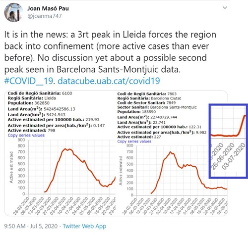
The trend visualization alerted us about something happening in the south of Barcelona on the 30 of June 2020 (beyond the outbreak in the Segrià region which appeared in the media) and so we decided to report it on Twitter.
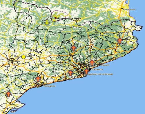
At the time of writing, we can see that this outbreak has spread throughout most of Catalonia, even though its growth slows down.
We can also see how, despite signs of a second outbreak of the disease in Catalonia (which is materializing as I write), with some places having more active cases now than at any time during the first spike, the death rate is, fortunately and to my surprise, far lower and less shocking than in the first outbreak.
 |
 |
|---|
Find out more about the development of the COVID-19 map browser.
References to the browser on external websites:
Reuse of open data on COVID-19 in Catalonia (Government of Catalonia).
Spanish Spatial Data Infrastructure (SDI) blog.
The browser appears in the SDI’s list of open COVID-19 resources,
and the Open Geospatial Consortium’s COVID-19 resources page.


